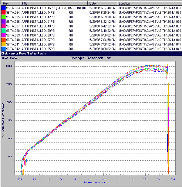
The new WinPEP software allows much more to be displayed at once.
Eventually, they will also have the Max Values, graphing cursor and other current features in there, but hey, this
is Beta. It does some very nice things though, look below.
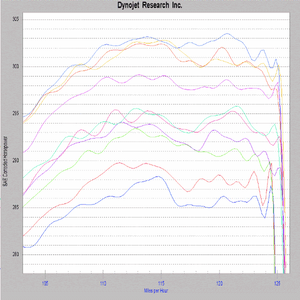
Here I can zoom in on the peak power area of the graphs. Let's get
a little closer though. See below.
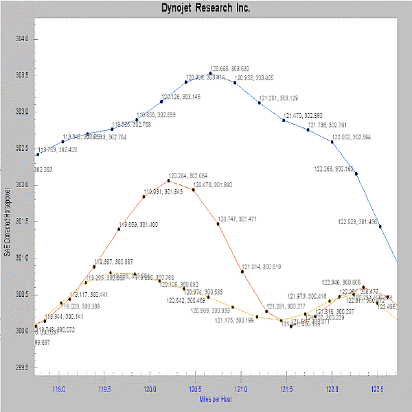
Check out the zooming capability of the new WinPEP software. Here I elected to plot
the data points (every point at which the dyno recorded a sample), and at each of those points, I told it to include
data labels, which makes it tell me the exact speed and horsepower at that point on the graph. If I had RPM selected
as the bottom axis, it would report the RPM and horsepower at each point. It also works for time on the bottom
axis and torque on the left or right axes. While it does not work yet, if you are using data acquisition, you can
split the graph into as many as three screens, plotting a different left and right axes for each screen, based
against the bottom axis. For instance, if I had left and right O2 sensors, boost pressure and water temperature,
I could set the graph up to show horsepower, torque, left O2, right O2, boost and water temperature versus RPM,
speed or time for up to 12 graphs at once. Like I said, lots of flexability here.

![]()